REAPER themes can be stored in a .zip file (and named .ReaperThemeZip) for distribution, but for development purposes they usually exist as a combination of files and a directory.
For an example of how a theme is put together, you can go to your ColorThemes path, and find the file "Default_5.0.ReaperThemeZip". Copy it, rename it to .zip, and extract the contents in this directory. You will see two relevant parts:
Default_5.0_unpacked.ReaperTheme -- this is the theme file which is selectable in REAPER's UI, and it controls the colors and fonts used by a lot of the user interface, including the arrange view and ruler, as well as the path to the images which should be loaded.
This file is a text file which you can edit by hand, or for many edits it is easier to do on the fly, by using the action "Theme Development: Show theme tweak/configuration window" in REAPER. The main line which will often need to be edited by hand is the line "ui_img=" in the [REAPER] section, which controls which folder to use theme images from.
Default_5.0_unpacked -- (a directory) This directory includes many images which will be loaded, and a special file named "rtconfig.txt"
The file rtconfig.txt is an important file, which can contain lines such as the following:
; comment
version 5 ; uses newer v5 theme composition mode, recommended for new themesc (also enables PNG support) (REAPER 5.0+)
use_pngs 1 ; enable png support
use_overlays 1 ; enable button overlay image support (see below)
tinttcp 0 ; overrides tinttcp= line in reaper.ini (REAPER 5.0+)
peaksedges 0 ; overrides peaksedges= line in reaper.ini (REAPER 5.0+)
tcp_folderindent 22 ; size of folder indentation
tcp_heights 3 24 49 72 ; default height of tcp panels, super-collapsed, small, medium, and full heights
tcp_master_minheight 74 ; minimum height of tcp master
tcp_voltext_flags flag maxlen ; flag for volume strings: set 1 for no-dB, 2 for no-fractional-precision, 4 for no + on positive values, 8 for always show two digits of precision. maxlen specifies max length of total string.
tcp_master_voltext_flags flag maxlen ; see tcp_voltext_flags
mcp_voltext_flags flag maxlen ; see tcp_voltext_flags
mcp_master_voltext_flags flag maxlen ; see tcp_voltext_flags
tcp_vupeakwidth 1 ; size (in px) of the peak hold indicator for track panel meter
mcp_vupeakheight 1 ; size (in px) of the peak hold indicator for mixer meter
mcp_mastervupeakheight 1 ; size (in px) of the peak hold indicator for the mixer master meter
tcp_showborders 1 ; set to 0 to disable borders in the track panels (deprecated)
mcp_showborders 1 ; set to 0 to disable borders in the mixer (deprecated)
transport_showborders 1 ; set to 0 to disable borders in the transport
mcp_altmeterpos 1 ; put MCP meters on right side (deprecated)
tcp_vol_zeroline AABBGGRR ; sets the ABGR value of the tcp's volume fader zero line. FFFF0000 would be solid blue, for example (v2.0+) -- note that this used to be documented incorrectly.
tcp_pan_zeroline AABBGGRR ; tcp pan fader zero line color (v2.0+)
tcp_width_zeroline AABBGGRR ; tcp width fader zero line color
mcp_vol_zeroline AABBGGRR ; mcp vol fader zero line color (v2.0+)
mcp_pan_zeroline AABBGGRR ; mcp pan fader zero line color (v2.0+)
mcp_width_zeroline AABBGGRR ; mcp width fader zero line color
trans_speed_zeroline AABBGGRR ; transport speed fader zero line color (v2.0+)
item_volknobfg AABBGGRR parm2 parm3 ; item volume knob, parm2 is zero-gain color, parm3 is pushed color
no_meter_reclbl 1 ; don't show tcp meter record-input label
gen_pan_zeroline AABBGGRR ; general pan fader zero line color
gen_vol_zeroline AABBGGRR ; general vol fader zero line color
warnings all ; can also specify pedantic -- note that this is only used if the theme is not zipped
adjuster_script name_of_theme_adjuster_script.lua
misc_dpi_translate src_scale_percent dest_scale_percent ; affects elements such as toolbar images: theme can specify one or more of these lines -- if the DPI scaling is higher than src_scale_percent, dest_scale_percent is used. so for example 'misc_dpi_translate 126 150' would ensure that the 1.5x images are used when the DPI is above 126%.
global_scale 1.0 ; can specify the inherent DPI-scaling of the theme -- e.g. if the theme is all hidpi images, setting this to 2.0 would prevent a 2x display from scaling those images up further.
layout_dpi_translate requested_layout_name min_scale destination_layout_name ; remapping of layouts by DPI. if DPI is > min_scale (where 1.0 = 100%, 1.5=150%, etc), then if requested_layout_name is chosen by user, destination_layout_name will be used instead. Note that you can use an empty requested_layout_name to match the default layout.
topImage Types
REAPER will load images, from the list below. Most images can have sizing metadata included in the form of pink (RGB(255,0,255)) and/or yellow (RGB(255,255,0)) lines on the upper-left and lower-right corners.
Notes on the types:
Types:
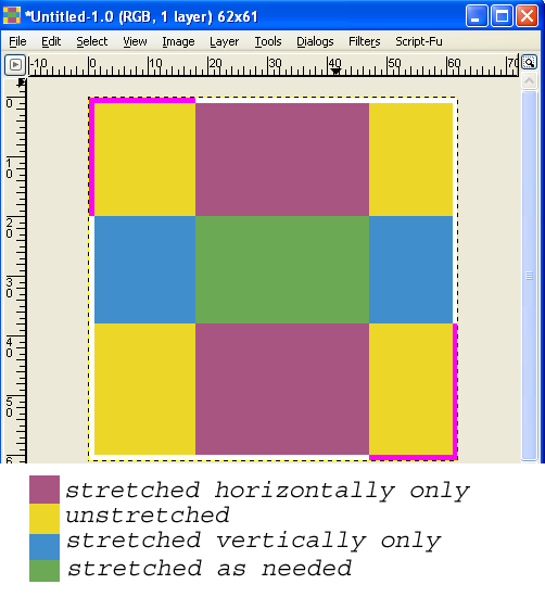
bg: an image with optional pink lines defining unscaled areas, and optional yellow lines for outer extent.
If you wish to have the outer edges of the background not stretched, you can define these regions by making the upper left and lower right corners pink (255,0,255), and having lines going along the edges of the image to specify the unstretched portion:
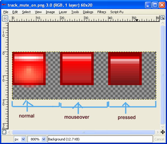
sliced-button: 3-slice image (left to right) of button images (normal, mouseover, pressed). Can include pink lines for edge scaling. Can also have overlay image (imagename_ol.png), if enabled in rtconfig.txt, which includes pink lines to define outer extent.
The image should be 3 images next to eachother, for normal, mouseover, and mouse pushed images.
Alpha channel is supported. The image will be stretched to fit any buttons:
Normally these images will be a multiple of 3 in width (since there are 3 sub-imageas). You can also use pink lines similar to the background image, in which case the width will be 2 pixels greater than a multiple of 3.
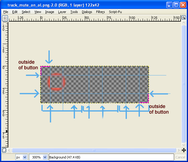
If use_overlays is set to 1, overlay images will also be loaded if found for buttons. Overlay images are useful for drawing shadows or highlights of buttons, typically outside of the button (and inside if you want it to interact nicely with other shadows as well). These images are named image_name_ol.png (i.e. track_mute_off_ol.png). These images will typically be mostly transparent, and are similar in format to the normal button image, except they should have pink lines in the upper left and lower right corners to delimit the area that would be outside of the button region. Overlays can also include yellow with their pink, in which case the yellow defines the outer area, and the pink defines the stretch region.
knob-stack: an image that is used as a knob stack. The image is treated as a group of image slices, spread along the larger dimension of the image.
If the image has no pink corner lines, the smaller dimension is used as the slice size. The image will be drawn square (and centered in the knob area if needed).
If the image has pink lines only, the pink line on the top or left (depending on the axis of the slices) define the slice size, allowing for non-square slices. The image will be drawn with aspect ratio preserved in the knob area.
If the image has yellow lines in addition to pink lines, the yellow lines define the outside area, where the image is drawn according to the above logic, but with an outer extent region as specified by the yellow pixels. Note that yellow pixels being used require a certain amount of pink to signify that the logic should be active.
Finally, in the instance where there are tcp_knob_stack and tcp_knob_stack_1 etc, the image used will be selected from from these images based on aspect ratio and size.
Meter images:
These images form the lit and unlit states of each of the VU meters. You can also have them function as a mask over the default meters by using the alpha channel (i.e. transparency = stock meter).
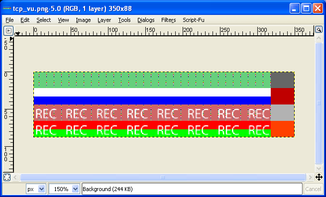
tcp_vu.png: track meter:
This image should be at least 64 pixels wide (W) and a multiple of 8 pixels high (H). It consists of 8 slices of image, each W pixels wide and H/8 pixels tall. The rightmost 32 pixels of each slice will be scaled to fit the "clip indicator" for the meter, and the leftmost W-32 pixels will fill the rest. The ordering of slices is as follows:
Left channel, dim meter, normal
Right channel, dim meter, normal
Left channel, lit meter, normal
Right channel, lit meter, normal
Left channel, dim meter, record armed
Right channel, dim meter, record armed
Left channel, lit meter, record armed
Right channel, lit meter, record armed
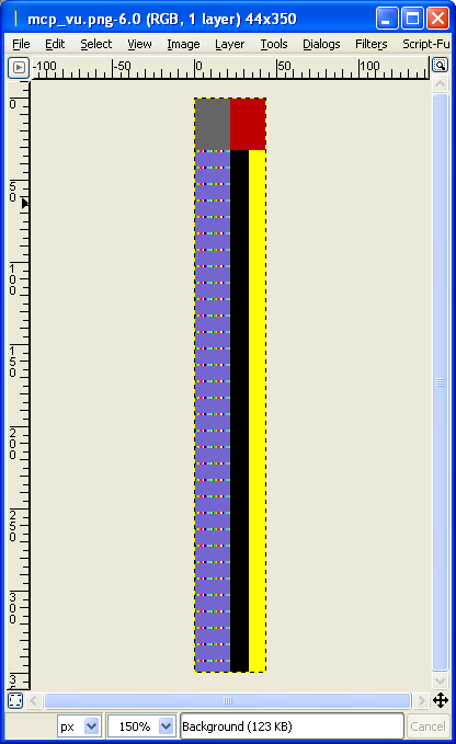
mcp_vu.png: mixer meter:
This image should be a multiple of 4 pixels wide (W), and at least 64 pixels tall (H). It consists of 4 slices of image, each W/4 pixels wide and H pixels tall. The topmost 32 pixels of each slice will be scaled to fit the clip indicator area, and the bottommost H-32 pixels will fill the rest of the meter. The ordering of slices is as follows:
Left channel, dim meter
Right channel, dim meter
Left channel, lit meter
Right channel, lit meter
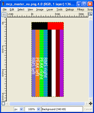
mcp_master_vu.png: mixer master meter:
This image should be a multiple of 8 pixels wide (W), and at least 64 pixels tall (H). It consists of 8 slices of image, each W/8 pixels wide and H pixels tall. The topmost 32 pixels of each slice will be scaled to fit the clip indicator area, and the bottommost H-32 pixels will fill the rest of the meter. The ordering of slices is as follows:
Left channel, RMS, dim
Left channel, peak, dim
Right channel, RMS, dim
Right channel, peak, dim
Left channel, RMS, lit
Left channel, peak, lit
Right channel, RMS, lit
Right channel, peak, lit
Scrollbar image:
A tutorial for scrollbar skinning is available here.
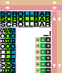
scrollbar.png:
This image contains all the scrollbar elements. It needs to have a dimension of 204x238px.
The pink (RGB color: 255,0,255) sections determines how each slice will be stretched. The areas delimited by the pink color will not be stretched.
Horizontal scrollbar background (on state) - (0,17)-(204,34)
The horizontal scrollbar has 2 pink areas defined on line 35, one for each side of the scrollbar.
Vertical scrollbar background (on state) - (187,37)-(204,238)
The vertical scrollbar has 2 pink areas defined on column 168, one for each side of the scrollbar.
Horizontal thumb (off state) - (0,37)-(167,54)
Horizontal thumb (mouseover state) - (0,54)-(167,71)
Horizontal thumb (on state) - (0,71)-(167,88)
The horizontal thumb has 3 pink areas defined on line 89: left, middle and right sides.
Vertical thumb (off state) - (0,91)-(17,238)
Vertical thumb (mouseover state) - (17,91)-(34,238)
Vertical thumb (on state) - (34,91)-(51,238)
The vertical thumb has 3 pink areas defined on column 52: top, middle and bottom sides.
Up button (116,121)
Left button (116,141)
Right button (116,161)
Down button (116,181)
Zoom in button (116,201)
Zoom out button (116,221)
Each button is 17x17px and has 3 states: off, mouseover, pushed.
Extended mixer views (v2.0+):
The following images can be used to customize the appearance of the extended mixer views. Alphachannel is supported on all of these.
Background images (supporting the standard panel background stretch options as described above):
mcp_sendlist_bg.png: background of track send list
mcp_fxlist_bg.png: background of track fx list
mcp_master_fxlist_bg.png: background of master track fx list (wider usually -- if omitted then the normal track image will be used instead)
Per-slot button images. These are all three slices of equal height, arranged vertically (top slice being normal, second being mouseover, and third is pressed). Note that panel background stretch isn't currently supported.
mcp_fxlist_off.png: FX list, fx is offline
mcp_fxlist_byp.png: FX list, fx is bypassed
mcp_fxlist_norm.png: FX list, normal state
mcp_fxlist_empty.png: FX list, empty slot
mcp_master_fxlist_off.png: Master FX list, fx is offline (if omitted normal track FX image used)
mcp_master_fxlist_byp.png: Master FX list, fx is bypassed (if omitted normal track FX image used)
mcp_master_fxlist_norm.png: Master FX list, normal state (if omitted normal track FX image used)
mcp_master_fxlist_empty.png: Master FX list, empty slot (if omitted normal track FX image used)
mcp_sendlist_norm.png: Send, normal
mcp_sendlist_mute.png: Send, muted
mcp_sendlist_empty.png: Send, empty slot
(otherwise) a normal image that may or may not be sliced/scaled, depending on the description of the item